In the digital age we live in now, data is all around us. It affects how we make choices, how we live our lives, and how businesses do well. But have you ever thought about how different kinds of data are shown in different data charts? In this blog, we’ll talk about the basics of data types, popular types of charts, and real-world examples of data to help you understand how important it is to us.
Types of Data
Qualitative Data: This type of data is descriptive and deals with qualities or characteristics that cannot be measured in numbers. For instance, the colors of cars in a parking lot, the names of people attending an event, or the types of fruits in a basket are examples of qualitative data.
Quantitative Data: Quantitative data, on the other hand, consists of numerical values that can be measured and analyzed. It can be further categorized into two subtypes:
- Discrete Data: This data represents distinct, separate values. For example, the number of students in a classroom or the count of cars in a parking lot.
- Continuous Data: Continuous data is measured on a continuous scale and can take on any value within a given range. Examples include temperature, height, or weight.
Categorical Data: Categorical data is used to classify information into groups or categories. It’s non-numeric and includes data like gender (male, female, other), types of fruits (apples, oranges, bananas), or survey responses (satisfied, neutral, dissatisfied).
Ordinal Data: This type of data represents ordered categories. While it’s similar to categorical data, it has a specific order or rank associated with it. For instance, education levels (high school, bachelor’s, master’s, Ph.D.) or customer satisfaction ratings (poor, fair, good, excellent) are examples of ordinal data.
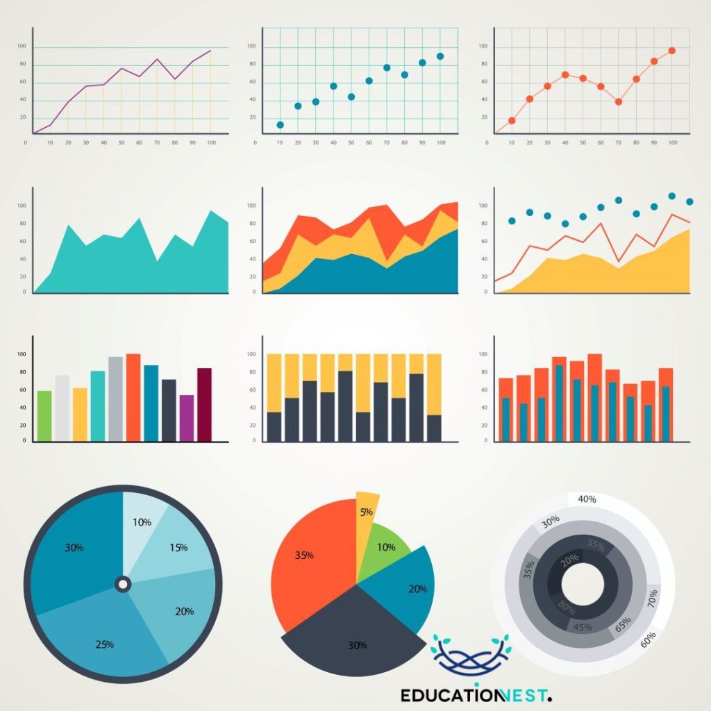
Types of Data Charts
Now that we’ve covered the basics of data types, let’s explore some common types of data charts used to visualize and interpret data:
Bar Charts: Bar charts are excellent for displaying categorical or discrete data. They consist of rectangular bars, with each bar representing a category and the height of the bar indicating the frequency or value associated with that category.
Example: A bar chart can represent the sales of different smartphone brands in a given year.
Line Charts: Line charts are used to show trends or changes over time for continuous data. They connect data points with lines, making it easy to visualize how values evolve.
Example: A line chart can display the temperature fluctuations over a week.
Pie Charts: Pie charts are ideal for illustrating parts of a whole. They divide a circle into segments, with each segment representing a proportion of the total.
Example: A pie chart can depict the distribution of expenses in a household budget.
Scatter Plots: Scatter plots are used to visualize the relationship between two continuous variables. Each data point is plotted as a point on the graph, making it easy to identify patterns or correlations.
Example: A scatter plot can show the relationship between hours spent studying and exam scores.
Histograms: Histograms are used to display the distribution of continuous data. They group data into bins or intervals and represent the frequency of data points falling within each bin.
Example: A histogram can depict the distribution of ages in a population.
Also Read:
What is Data Visualization and How to Use It
Data Chart Examples
Let’s look into some real-world examples to better understand how data types and data charts work together:
Example 1: E-commerce Sales
Imagine you run an online store, and you want to analyze your sales data for the past year. Here are the data types and charts you might use:
Data Types: You’ll have quantitative data for sales revenue and discrete data for the number of products sold.
Charts:
- Bar Chart: To compare monthly sales figures.
- Line Chart: To track the overall sales trend over the year.
- Pie Chart: To visualize the distribution of product categories in your sales.
Example 2: Movie Ratings
Suppose you’re a movie enthusiast and want to analyze the ratings of your favorite movies. Here’s how you might approach it:
Data Types: You’ll have categorical data for movie genres and ordinal data for ratings (e.g., 1 star to 5 stars).
Charts:
- Bar Chart: To compare the average ratings of different genres.
- Pie Chart: To see the proportion of each genre in your movie collection.
- Histogram: To understand the distribution of movie ratings.
Conclusion
In our data-driven world, understanding different data types and how to represent them through charts is crucial. Whether you’re a business owner, a student, or simply someone curious about the world around you, data plays a significant role in making informed decisions and gaining valuable insights.
By understanding qualitative and quantitative data, as well as different data chart types like bar charts, line charts, pie charts, scatter plots, and histograms, you can effectively share information, spot trends, and make decisions based on data.
So, the next time you encounter data, remember that it’s not just numbers and figures; it’s a powerful tool that can transform the way you understand and navigate the world. Whether you’re analyzing sales data for your business or exploring movie ratings for personal enjoyment, data and charts are your allies on the journey to better decision-making.