Managing and interpreting data well helps organizations look for patterns in their data. But the accuracy of any data visualization depends on the platform used. To meet the demand for visualizing data, Matplotlib in Python is an effective option because it makes it easy to analyze data and figure out what it means.
A Matplotlib developer can assist your business in growing without hindrance because they understand how to use the platform to achieve the best results.
In this article, we will explain what Matplotlib in Python is, how to use it, and give a quick overview of Matplotlib inline.
What is Python Matplotlib?
Matplotlib is a Python library for plotting two-dimensional arrays. Matplotlib is a library for plotting data that works on various platforms. It is built on NumPy arrays and is designed to work with the rest of the SciPy stack.
John Hunter came up with the concept in 2002. Its visualizations allow us to see huge amounts of data in ways that are easy to comprehend. Matplotlib is API documentation that allows you to browse right away, use keyboard shortcuts, work offline, have a mobile version, and more.
Matplotlib has a number of plots, such as line, bar, scatter, histogram, and more.
Installation: matplotlib and most of its components come as wheel packages for Windows, Linux, and macOS.
Installing Matplotlib in Python: Steps

Step 1: Make sure that Python and pip are already installed on the computer.
In the command prompt, type the following commands:
To look at Python, type python –version.
If Python is set up correctly, the version of Python on your computer will be shown.
To look at pip, pip -V
If pip is installed correctly on your system, its version will be shown.
Step 2: Install Matplotlib
Pip can be used to install Matplotlib. To set up Matplotlib, type the following command into the command prompt:
pip install matplotlib
With this command, packages related to the matplotlib library will start to be downloaded and set up. Once completed, a message indicating installation success will be shown.
Step 3: Check to see if it’s been set up correctly.
Run the following command in the command prompt to make sure that matplotlib is set up correctly on your system.
If matplotlib is installed successfully, the version that was installed will be shown.
import matplotlib matplotlib. version__
Read More: Top 10 Python Frameworks You Need to Know for Web Development
Example of Matplotlib in Python
import matplotlib.pyplot as plt
plt.plot([1,1])
plt.plot([2,2])
plt.plot([3,3])
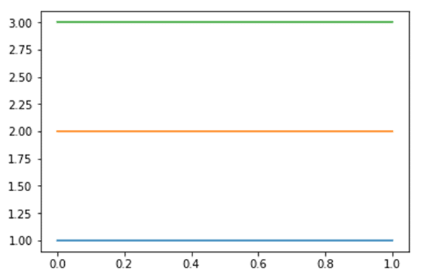
The above graph can be used to plot three straight lines. This is possible by using the plotting library, Matplotlib.
Uses Of Matplotlib In Python
Matplotlib is a Python library that lets you make static, animated, and interactive visualizations.
Here is a list of matplotlib’s uses.
- Produce plots suitable for publication.
- Create interactive figures with the ability to zoom, pan, and update.
- Style and layout can be changed easily.
- Export to a variety of file types in one go.
- Includes Graphical User Interfaces (GUIs).
- Makes use of a diverse set of third-party packages based on Matplotlib.
To define matplotlib inline in Python-
There are a lot of built-in functions in IPython. These are called “magic functions.” The magic functions are also called “magic commands” because they use a specific syntax.
Matplotlib inline is a magic command that can be used instead of a Python code to set up Matplotlib in the current IPython session. It is a time-saving function.
Use of Matplotlib Inline
The matplotlib inline command is very helpful because it shows how plots of different cells are different. The graph for each cell is drawn after the current cell, which doesn’t change the graphs for the cells before it.
It makes a space between the graphs in each cell so that changes like color palettes made in the current cell won’t affect the plots of any cells that came before.
Ways to Plot with Matplotlib in Python (Types)
There are different ways to plot the data, or techniques, that can be used. Here are some of the plotting types:
- Line Plot
A line plot shows how the frequency of data points changes along a line. It is one of the easiest and most common ways to plan a story. Line plotting is a primitive way to plot because it was one of the first ways to plot.
- Plot Using a Bar Chart
Categorical data can be shown as rectangular blocks with different heights or lengths that are proportional to the values. A bar chart is a way to show information in this way. Bar charts can be used both vertically and horizontally to show data.
- Area Plot
Most of the time, this type of plotting is used for quantitative data. A line chart is the basis for an area plot, which uses colors to show the area between the axis and the line.
- Pie Plot
Statistical data can be shown in a pie plot, which is a circular graph with slices that each represent a different piece of data. Each slice is proportional to a different value in the data. This kind of plot is mostly used in business and the media.
- Scatter Plot
A scatter plot is made by plotting multiple variables as a series of dots along the x and y axes. If we need to, we can use different colors for each bike to make plotting and identifying the dots easier.
- Histogram Plot
Histogram plotting is based on using rectangular blocks to show numerical data in a precise way. A histogram plot can be used to estimate how likely something is. Based on the data set used to plot the graph, most of the data is shown in a continuous way.
- 3D Plot
The 3-dimensional plotting involves putting data along the x, y, and z axes to make the data easier to see. 3D plotting is an advanced method of graphing that lets us see how the data are represented along the three axes of the graph better.
Example of making a line chart in Python with Matplotlib
Let’s look at a real-life example:
Suppose a survey needs to be done on how far the following vehicles have traveled in ten days. There are different ways to plot the collected data.
The following code is what we will use:
import matplotlib.pyplot as plt
x = [1,2,3,4,5]
y = [50,40,70,80,20]
y2 = [80,20,20,50,60]
y3 = [70,20,60,40,60]
y4 = [80,20,20,50,60]
plt.plot(x,y,’g’,label=’Enfield’, linewidth=5)
plt.plot(x,y2,’c’,label=’Honda’,linewidth=5)
plt.plot(x,y3,’k’,label=’Yamaha’,linewidth=5)
plt.plot(x,y4,’y’,label=’KTM’,linewidth=5)
plt.title(“bike details in line plot”’)
plt.ylabel(‘ Distance in kms’)
plt.xlabel(‘Days’)
plt.legend()
Conclusion
Matplotlib in Python is mostly used to deal with multiple or huge amounts of data and show them in graphs to make them easier to understand.
This concludes this module of the Python tutorial.
We learned the basics of Python, Matplotlib, and how it is used for data visualization. This tutorial should have been a good example of what Python Matplotlib is and how it uses different techniques to plot data.